Smart Marine
Brand Visual Identity
Raigo Lilleberg (Kreit)
Research, Concept, Logo & Visuals
With:
Smart Marine →

Story
Client
Smart Marine provides vessel maintenence and annual survey services for ship navigation and radio communication devices, wordlwide.
They are new in the market. They are small. They are a team of highly qualified experts with a long history of practice.
Goal
Today there is the know-how, experience and system for the service, but lack of stability and awearness amongs new clients. No brand to releate to or attatch oneself to.
So the main goal is to design a new visual identity and language, that will help to build the awearness of Smart Marine in their potential new clients and also better position in market.
Process
The interviews with client and competition anayze, cave good starting point, what the feel and look should preferably be. Conservative, but enough modern and in brighter, calmer tones.
Considering the input, some research was done in marine and navigation history, where the most inspiring finds were the graphics of the sea maps. The wavy lines.
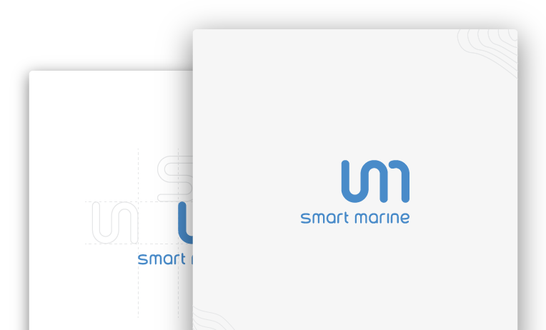
Therefor the logomark is a direct correlation to waves, that communicate quite well the products (navigation and radio communication devices) Smart Marine maintains.
Another structrual influencer for the logomark, was Herbert Bayer's typeface "Universal Aplhabet" or just "Universal" (designed 1925, for the legendary Bauhaus Design School), that was taken basis and modified for the wordmark.
Final thoughts
Together with client, we were able to design a perfect solution (set of tools), that, used correctly and consistently, will build Smart Marine's new brand – with growth in awearness and positioning.


