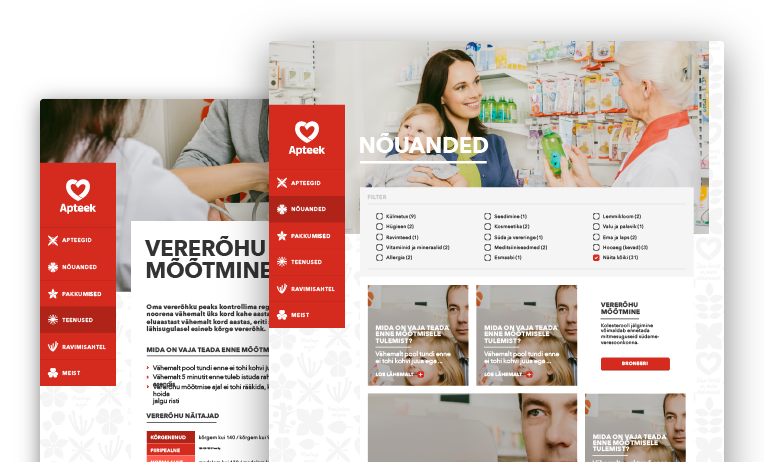
Südameapteek
Web
Raigo Lilleberg (Kreit)
UI Design, Information Architecture & User Flow
With:
Südameapteek →
Evelin Randlane, Liis Viljar &
Margus Simson (Ziraff) →

Story
Client
Südameapteek is one of the biggest pharmacy chain in Estonia, that also provides different health and consultancy services.
Goal
Website design that has tons of different informative and partially interactive content, and a need for a strong brand communication throughout the site’s visual feel.
Partner
Ziraff is an e-services expert, focusing mainly on finance and accounting, e-health and e-government areas.
Process
Approached with the task to team-up with the partner to design visuals for the site.
As the content structure and usability strategy for the website was mostly complete we were able to take on the layout and visual.
Strong basis for the visuals like colors, typography and some graphical elements came from the client’s brand manual. This left us more time to work with the overall layout visuals and to improve the content structure and usability issues along the way.
Most thorough parts of the project were definitely the intense strategizing and back-and-forth improvement of usability.
We had a lot of open discussions and different types of small, in-house testing cycles.
The outcome was a simple, functional site with a strong and recognizable visual brand language.
Final thoughts
Well thought-through design strategy, research and in-house testings helped a lot in creating visual solutions that supported previously set objectives and more importantly, fulfilled the users’ needs.


